I'm keen to know if I'm just stating something that's obvious here, or whether I've stumbled across a correlation that might be useful in our efforts to understand patient flow.
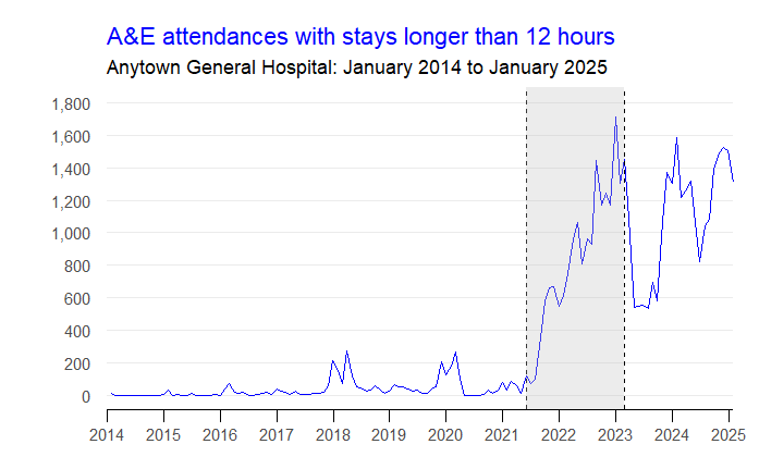
The striking thing about this hospital's ED >12-hour stays chart is that there was a 21-month period (shaded grey) when things went from 'maybe-just-about-tolerable' in May 2021 to 'catastrophically dysfunctional' by February 2023.
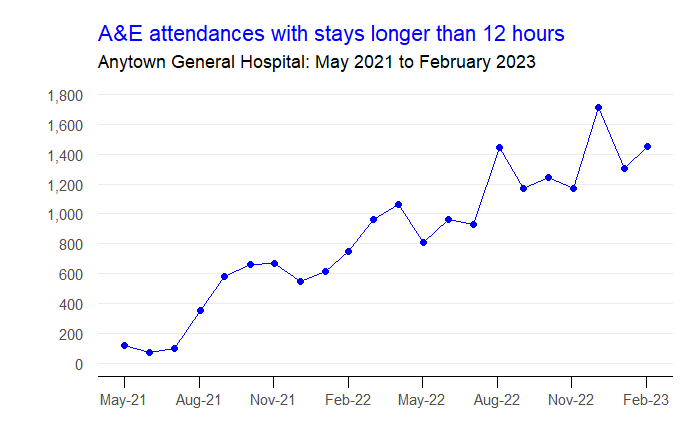
Let's zoom into that 21-month period. I'm a data analyst. I want to find an indicator that moved in either the same or the opposite direction with the same force and velocity in the same period.
In an attempt to find that indicator, let me see if I can follow the steps along the patient flow chain reaction.
We can say—I think—that long stays in the ED are mainly caused by exit block. And the most important (as in: most often called-upon) exit for the ED is the Acute Medical Unit (AMU).
The AMU's fullness didn't change much between May 2021 and Feb 2023. It was pretty much always full. 91% bed occupancy in spring 2021. 93% bed occupancy in winter 2023. But within that context of being always full, the AMU's patients 'moved' progressively more slowly. Its average length of stay in May 2021 was 23 hours; by February 2023, it had more than doubled to 55 hours.
The AMU was admitting and discharging an average of 55 patients a day in May 2021. But it was only admitting and discharging 28 patients a day in February 2023. And the key number here is the discharges. Yes, some of these discharges were of patients going home. But most of these discharges were transfers into the specialty beds downstream of AMU.
And because the specialty beds were also turning over more slowly, the rate at which AMU patients could be transferred into them was also slowed right down.
So: what happens when we look at the number of AMU discharges per month over that 21-month period? Here is the graph.
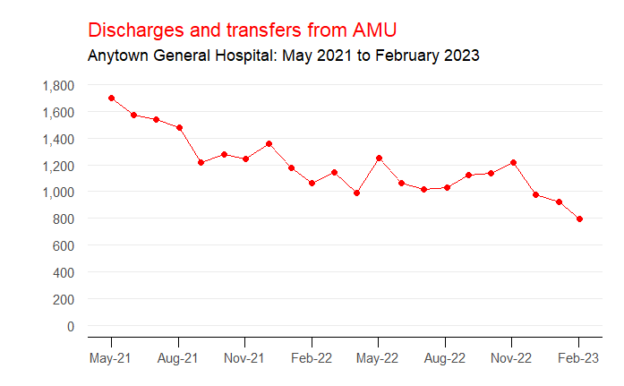
The reduction in AMU outflow mirrors almost perfectly the increase in >12-hour stays in the ED that we saw at the beginning. And if we plot both measures on the same graph—a scatterplot with AMU outflow on the horizontal axis and ED >12-hour stays on the vertical axis, with each dot being a month in that 21-month period—we can see the closeness (r = -0.89) of the relationship.

So yes, we've got ourselves a relationship. But is it a useful relationship? And—if it is—is it one that is replicated at other hospitals for the same period?
Flow_ology can be booked as an on-site face-to-face course for £1,250+VAT, and up to 12 participants can be accommodated in each workshop session. Email info@kurtosis.co.uk to start making arrangements. Open course places cost £350+VAT.