Visualizing Difference is a one-day course for NHS information analysts that covers several statistical techniques designed to show if a difference between two numbers really is a difference. Each technique is taught using real-life healthcare examples. And the examples are linked together by a single, unified narrative that unfolds as the course progresses. We use Microsoft Excel for the hands-on coursework.
The first session starts with an explanation and discussion of the Null Hypothesis. We then explore three different ways of testing for - and visualizing - differences between proportions: P-values, confidence intervals and the chi-squared test.
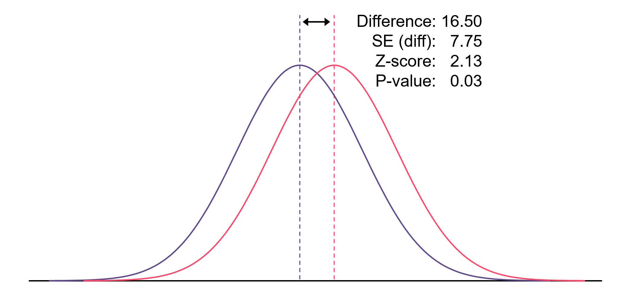
In the second session, we look at testing for the difference between means when the underlying data distributions are Normally distributed. We explore how to test for Normality using Q-Q charts, and then go through two ways of testing for statistically significant difference betwen means: the Large Sample Normal test and the t-test.
In the third session we explore how to transform non-Normal data to see if we can make it Normal. Additionally, we investigate the extent to which a P-value obtained from log-transformed data differs from a P-value obtained using the Large Sample Normal test. We also provide a brief overview of bootstrapping as a technique that can overcome the problem of non-Normality.
In the final session of the course we embrace non-parametric tests. By ranking the data, we can test for difference by using the Mann-Whitney U test. And we can also bring the Chi-squared test into play when we need to compare more than two proportions.
The course teaches the visualizations with a series of themed emergency care examples, so that the relevance of the techniques can be more easily grasped. The examples have been selected so that they are follow-able by people unfamiliar with the acute hospital environment. Every teaching example and exercise uses NHS data that has been used in real situations to shed light on real problems. This is not a course about statistical graphics for their own sake; it is about using visualization to make sense of real issues.
Visualizing Difference can be delivered as either an on-site, in-person, face-to-face workshop OR as a virtual course via Microsoft Teams. In either case, the cost is £1,250+VAT, and up to 12 participants can be accommodated. Email info@kurtosis.co.uk to start making arrangements.