There's a diagram Nick Tordoff and I use in our Data Conversations course, and which I've now started using in my Using Data to Make Business Decisions course. It shows what it might feel like to be a decision-maker who has to make a decision (or take an action) based on data, and it's a representation of how they'd decide whether or not to trust the data, and how they'd evaluate the risks and benefits associated with any action they might take.
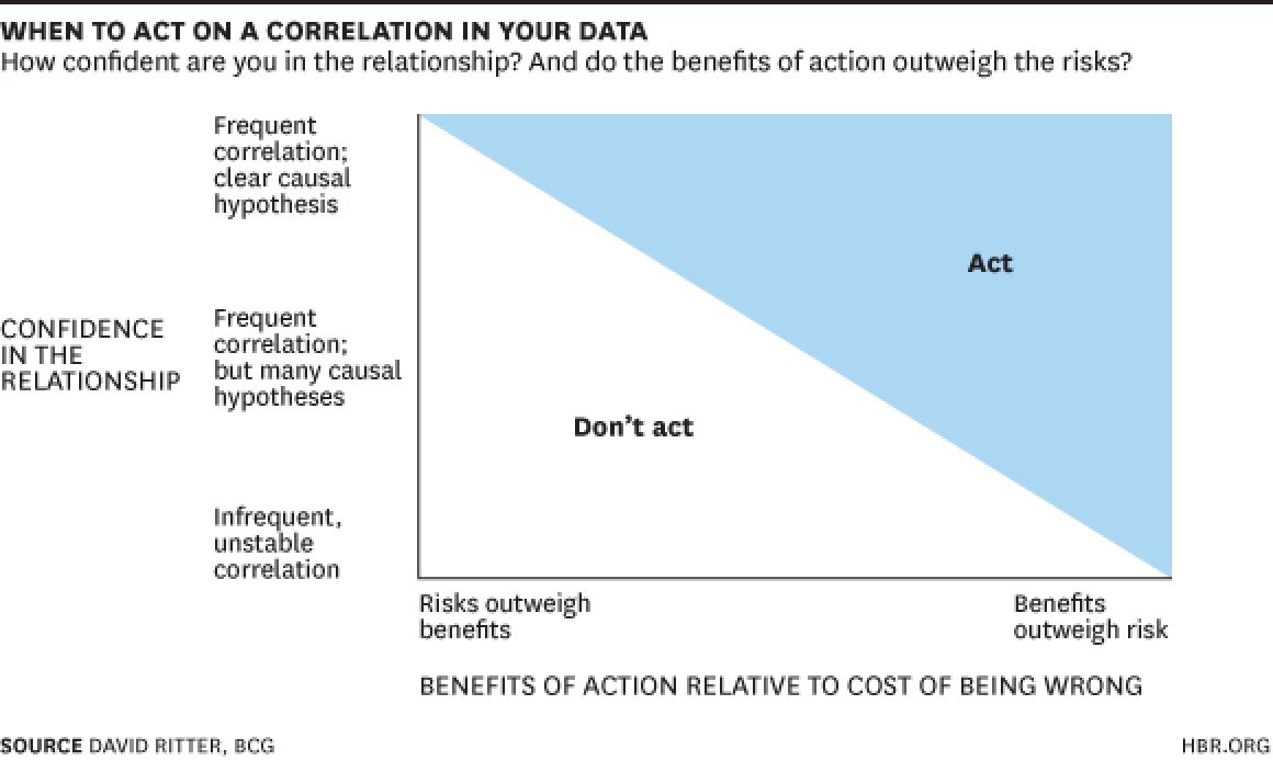
The diagram was created by David Ritter, who is—or at least was—may still be—a consultant working for the Boston Consulting Group. It's basically a scatterplot, where the x-axis measures risks (more risks on the left) versus benefits (more benefits on the right), and where the y-axis measures the strength of the correlation in the data. High correlation at the top; low correlation at the bottom.
The further to the right and to the top of the diagram a decision-maker finds themself, the more likely they are to make an actual decision—take an action, even—based on the data.
This diagram is useful for data analysts because it enables decison-maker empathy. If you're a data analyst and you're preparing some data that will be used to make a decision or take an action, then you can be more systematic about predicting how a decision-maker might critique your data.
It's a great diagram, I find it extremely useful, but I want to make David Ritter's y-axis a bit more generic. I'd prefer it if the y-axis measured confidence in the data rather than confidence in a relationship. I've taken the diagram from an article in which Ritter was talking explicitly about correlation; but in the context in which I want to use this diagram, I'd rather it said: "Do we have confidence in the data? Has the right measure been chosen? Has it been defined correctly? Is the data accurate?"
So you can now imagine that—as a data analyst preparing your data for a meeting—you can go through various iterations of your data exhibits, each time trying to nudge the dot on the Ritter scatterplot further to the right on the x-axis, and further to the top on the y-axis.
[27 February 2023]
If you want to get notifications by email of new content on the Kurtosis website, please email info@kurtosis.co.uk and ask to be added to the email subscription list.